Templates and Design Options
Go to Search → Search Engines → [your engine] → Design.
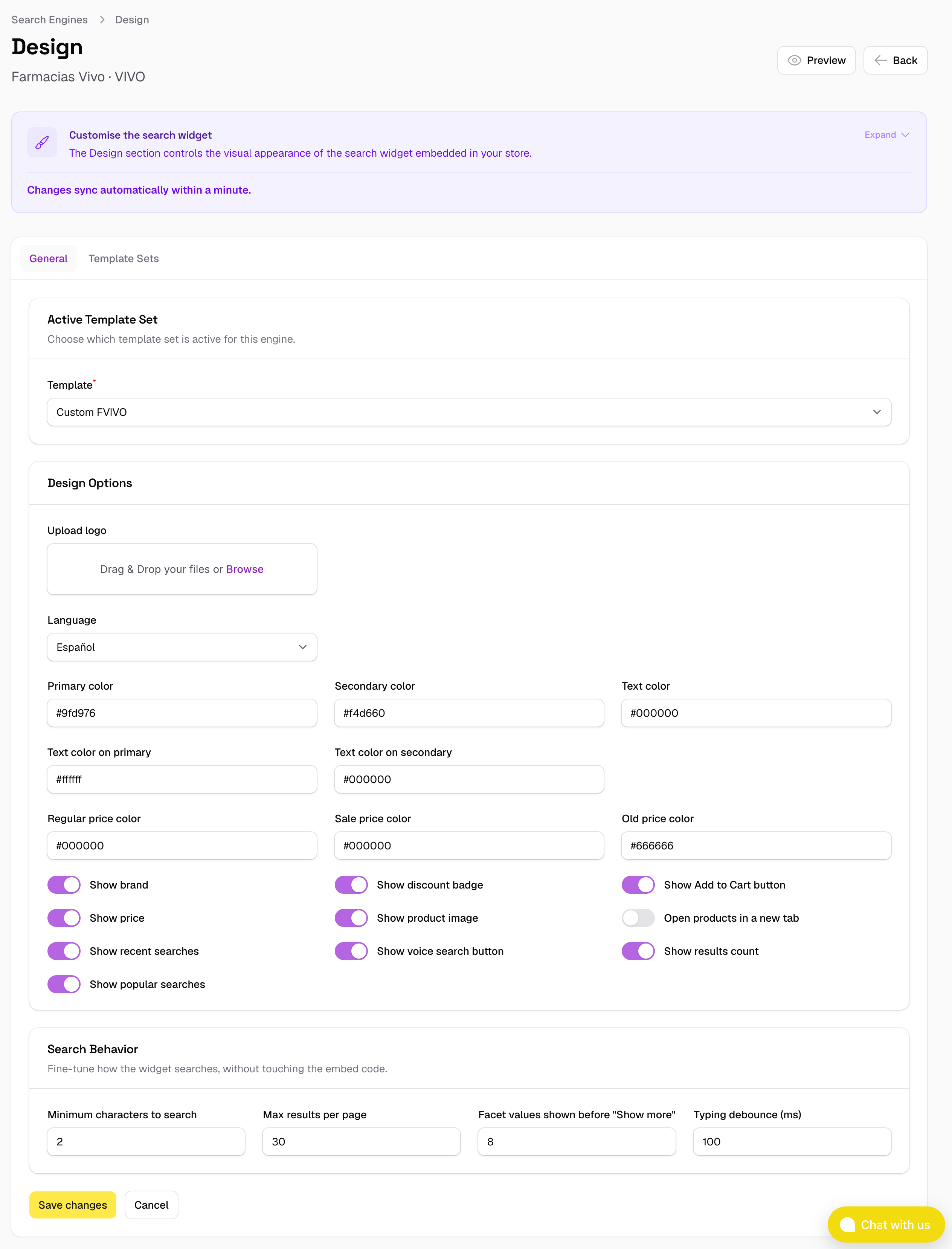
This section controls the visual appearance of your widget: which template set is active, the language of the interface, the colour scheme, and a set of optional display elements. It's split across two tabs, General and Template Sets.
Templates
Under General → Active Template Set, choose which template set is currently live for this search engine. The change applies automatically — no Feed Reindex needed.
SoloSearch ships with 6 ready-to-use template sets out of the box: an anchored style, where results appear inline below the search input, and two overlay styles, a centred panel and a full-screen takeover — each available in Light and Dark. Browse all of them — plus a few fully custom ones built for real shops — on the Demos page.
Template sets are fully customisable. Under the Template Sets tab, duplicate any built-in set to get your own editable copy, or build one from scratch. See Theming & CSS vars to restyle colours without touching any template code.
Language
The language setting controls the interface copy inside the widget — labels, placeholders, messages like "No results found", and any other text that is part of the widget UI (not product content).
Available languages depend on the translations included in the widget. Select the language that matches your shop's locale from the dropdown. If your language is not available, contact support.
Colours
You can configure the primary colour of the widget to match your brand. This affects interactive elements such as buttons, highlights, selected filter values, and focus rings.
The colour picker lets you set a custom hex value. Changes apply automatically within about a minute.
For more granular control over individual UI elements, see Theming & CSS vars.
Display options
Each of these can be toggled on or off independently, without editing any template — this is the whole point of Design Options: cover the common cases so most stores never need to touch template HTML.

Product card
| Option | What it shows |
|---|---|
| Show brand | Displays the product's brand name in the result card. |
| Show discount badge | Automatically calculates and displays a percentage discount badge when a product has both a price and a sale_price, and the sale price is lower. No manual configuration needed — the badge appears and updates based on the feed data. |
| Show Add to Cart button | Shows an "Add to cart" button on each result card. Requires a small integration on the store side to connect the button to your cart — see Add to Cart Button for implementation details. If a product can't be added to cart directly (e.g. a configurable or bundle product), the card shows a "View Product" link instead. |
| Show price | Displays the product's price on the result card. Turn off if you run a "price on request" catalogue. |
| Show product image | Displays the product thumbnail on the result card. |
| Open products in a new tab | Product links open in a new browser tab instead of navigating away from the search results. |
Search panel
| Option | What it shows |
|---|---|
| Show recent searches | A row of badges above the results, letting shoppers repeat one of their own recent searches. |
| Show voice search button | A microphone button next to the search field, for browsers that support voice input. |
| Show results count | The "N results" line above the result grid. |
| Show popular searches | The row of your store's most popular searches shown alongside filters, when there is data for it. |
All options apply regardless of which template set is active. Changes take effect automatically within about a minute.
Search behavior
Below Display options, a Search Behavior section lets you tune how the widget searches — again, without touching the embed code on your site:
| Option | What it does |
|---|---|
| Minimum characters to search | How many characters the shopper must type before a search request is sent. Defaults to 2. |
| Max results per page | How many results load per page; the next page loads automatically as the shopper scrolls (infinite scroll). Defaults to 30. |
| Facet values shown before "Show more" | How many values appear per filter before a "Show more" toggle appears. Defaults to 8. |
| Typing debounce (ms) | How long the widget waits after the last keystroke before sending a search request. Defaults to 100. |